Termios
Termios develops smart thermostats for residential and commercial buildings. I designed the mobile application their technicians use on site to survey a property and commission the hardware. As the only designer on the project, I was responsible for the app concept, information architecture, the complete installation flow, edge-case handling and the visual system through to developer handover.
- year
- 2023
- role
- lead design - sole designer
- scope
- full app concept, ux + visual
- client
- termios (via mantro)
- tools
- figma, adobe xd, illustrator
- status
- delivered, not launched
Context
Before a smart thermostat can be installed, the building has to be surveyed. A technician records the structural properties of each unit and the specifications of its existing heating hardware, then assigns each thermostat to the valve it will control.
This work is carried out on site rather than at a desk, frequently under poor lighting and time pressure, in buildings where the installed hardware is visually identical from unit to unit. The technician typically works one-handed, holding a device while operating the app.
Two constraints defined the project. Free-text entry is a liability, since any manually transcribed model number or device identifier introduces a point of failure that is invisible at the moment it occurs. And an incorrect thermostat-to-valve assignment is not detected on site; it surfaces afterwards as a service callout.
Following the walk
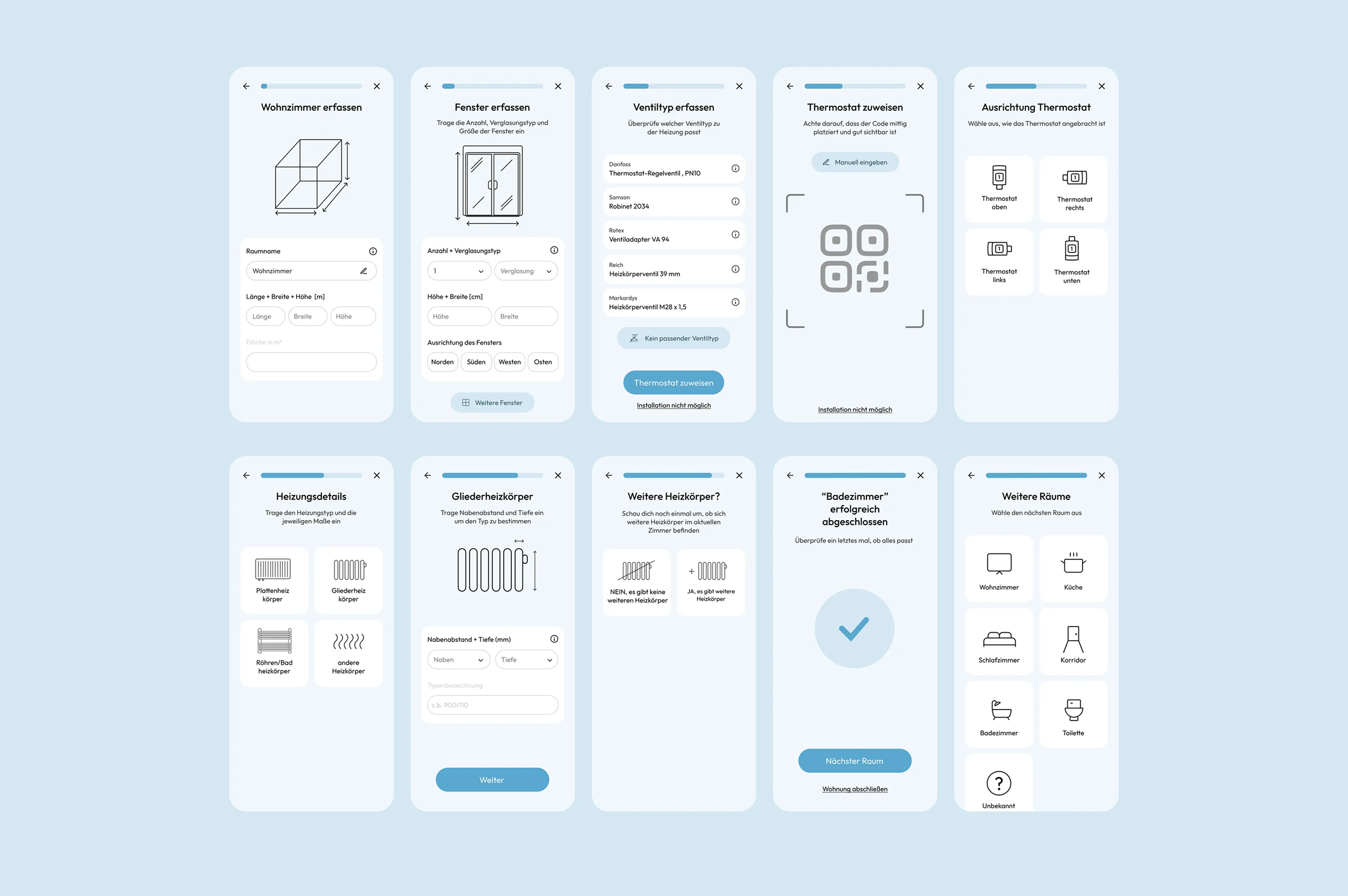
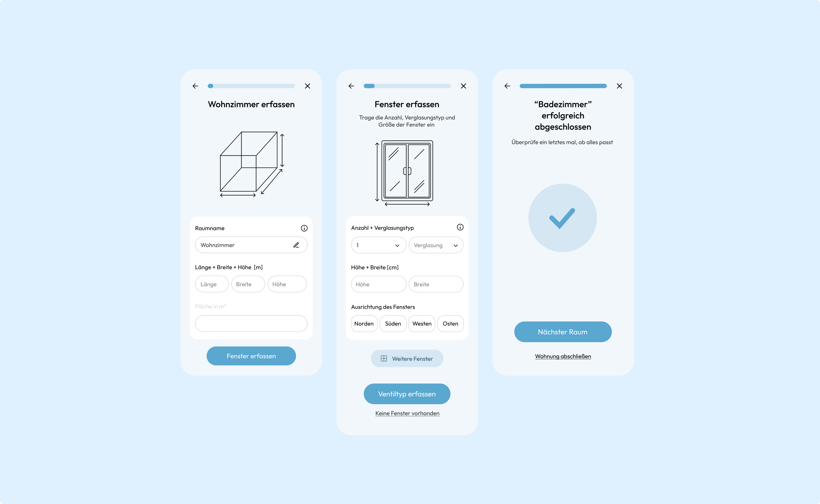
Structurally the survey is a data-entry task, and the conventional solution is a form. A form, however, assumes the person filling it in already has the information. A technician does not; the building is discovered while walking through it. The app therefore mirrors the physical route. The technician selects a room, records its properties and its heating hardware, closes it, and moves on. Each room concludes with an explicit confirmation before the next becomes available. Structuring the survey this way gave the technician defined pause points, which matters because site visits are routinely interrupted. It also removed the need to hold an abstract data model in mind: the sequence in the app corresponds to the sequence of the walk.
Pairing by scan, with defined fallbacks
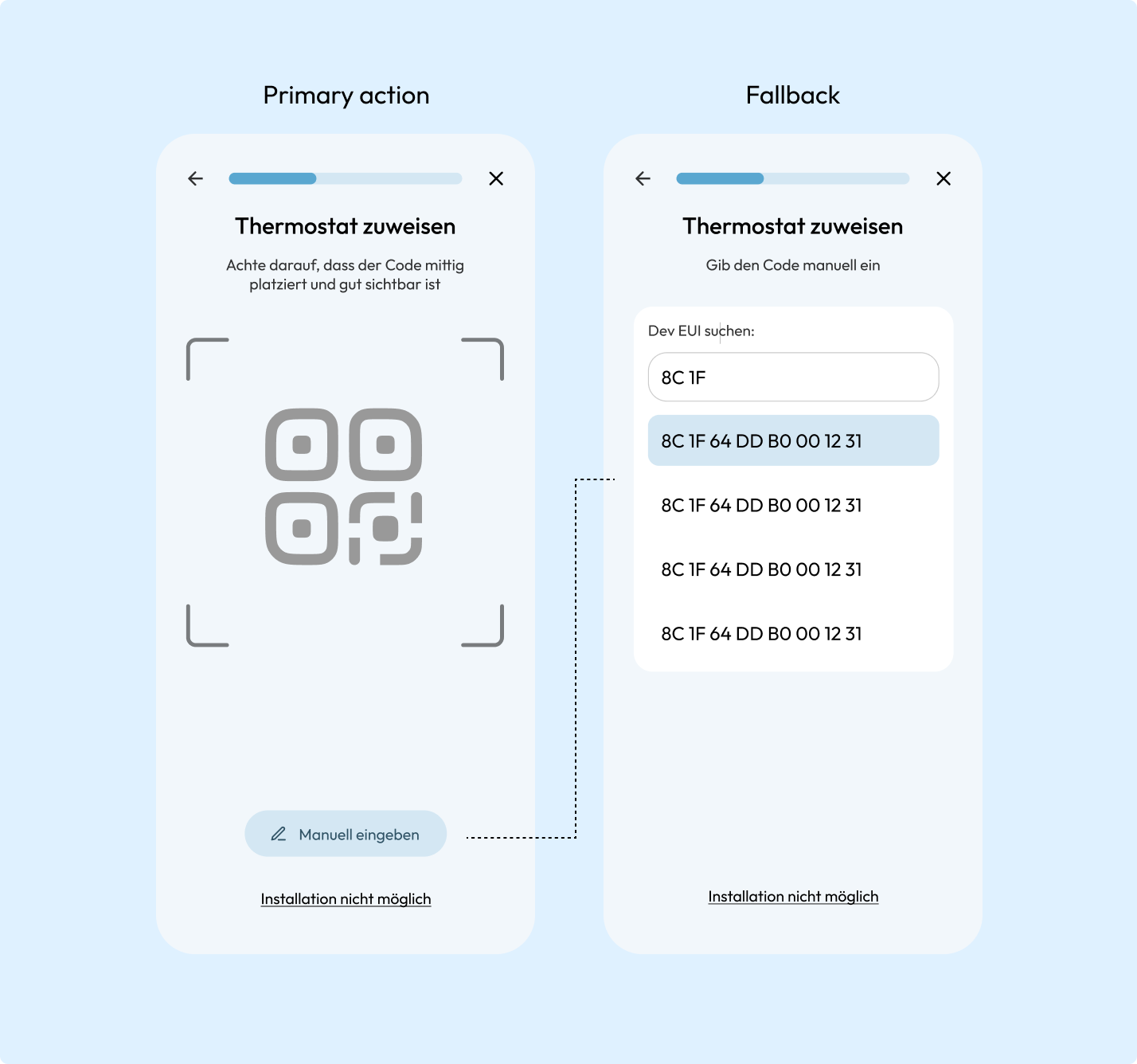
Assigning a thermostat to a valve is the most consequential step in the flow and the least self-correcting. In a building containing dozens of identical devices, a manually entered identifier cannot be verified by the person entering it. Scanning the code printed on the device eliminates the transcription step. I built the screen around the scanning reticle and reduced the instruction to the physical action required, since anything longer would not be read in the field. Because site conditions are unreliable, the screen offers manual entry as a second route. It presents the known device identifiers as a searchable list rather than an empty field, so the technician selects a value instead of typing one, and can return to the scanner at any point.
Recognition over reading
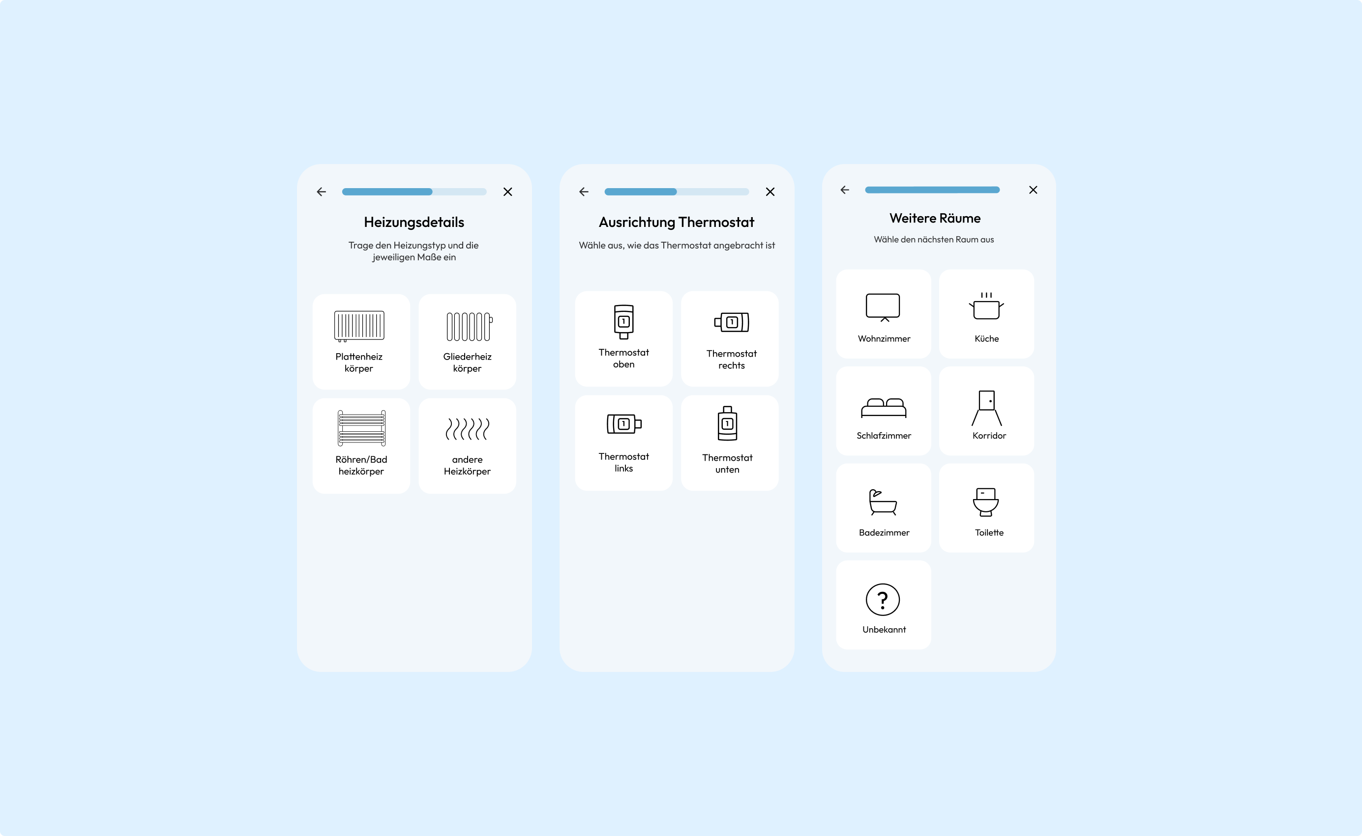
Several steps require selecting from a fixed set: radiator types, thermostat orientation, room designation. In each case the technician matches what is physically in front of them against a known catalogue, which is a recognition task rather than a reading task. These steps were built as icon grids, with a custom-drawn icon set covering every radiator type, mounting orientation and room category in the catalogue. Drawing them myself meant the level of detail could be tuned to the decision being made — a panel radiator and a column radiator differ by their profile, so that is what the drawings emphasise. A technician with field experience identifies the correct entry visually far faster than by parsing the corresponding German compound terms. Each grid also carries an unspecified option, since the catalogue is known but never complete.
Designing the exceptions
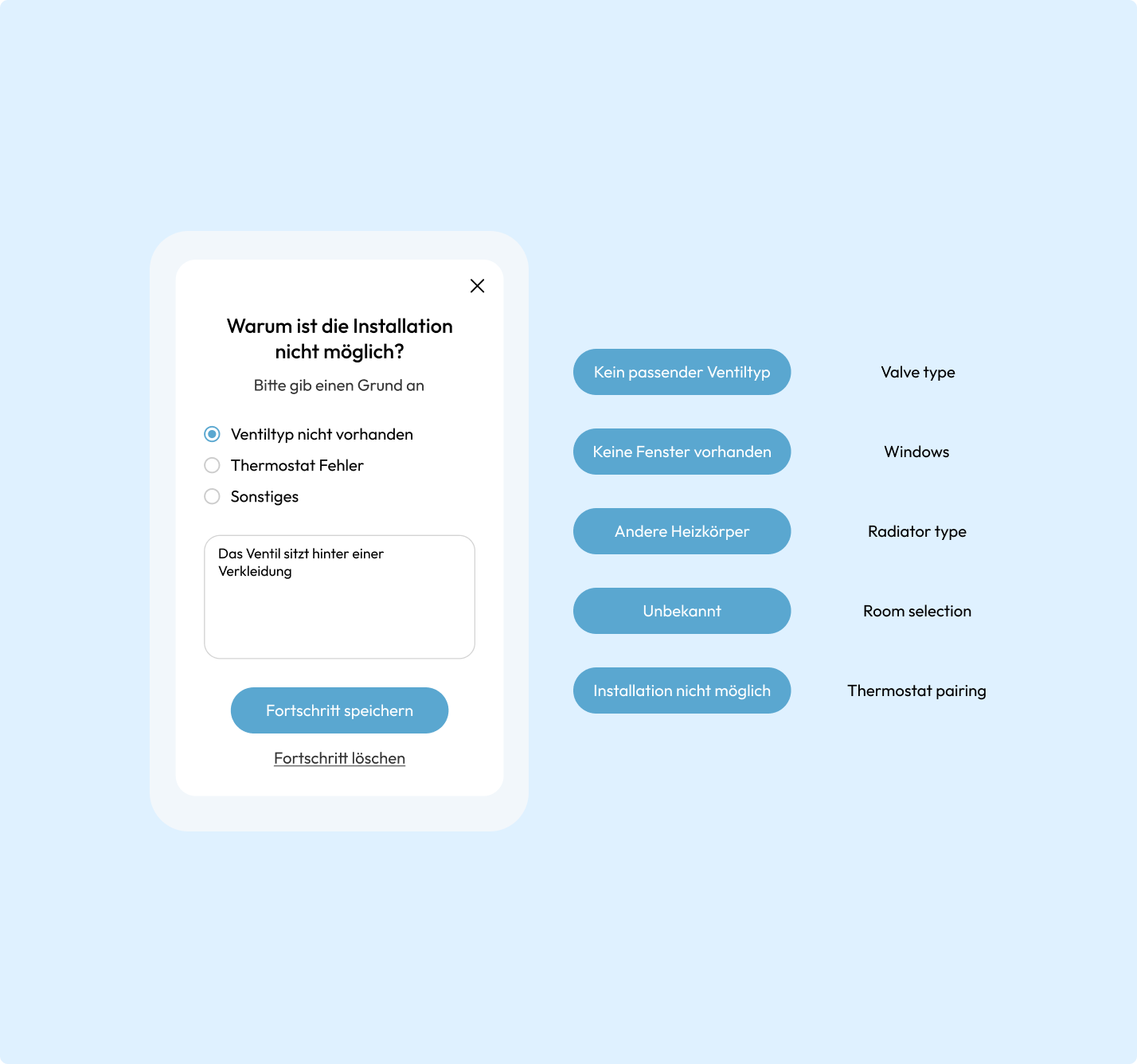
Across the survey, every step where the catalogue might not match reality has a defined route out: an unlisted valve type, a room with no windows, a room the technician cannot identify. The most consequential of these is an installation that cannot be performed at all. In that case the app does not simply exit. The technician selects a reason from a defined set, describes the situation in free text, and decides explicitly whether the work captured so far is kept or discarded. An aborted installation therefore produces a structured record rather than a gap.
Result
The project was delivered to developer handover in 2023. mantro, the company builder behind it, was acquired shortly afterwards, and I have no visibility into whether the app went into production. What the project turned on was recognising that an apparent data-entry problem was in fact a workflow problem. Following the technician's physical route through the building, removing manual transcription wherever the system could read or offer a value instead, and treating the blocked states with the same rigour as the successful path is what would have made the app usable under the conditions it was built for. The wider lesson holds for field tools generally: the exceptions are the product. The successful path was the fastest part of this project to design. Everything that determined whether the tool would hold up sat in what happens when the code is damaged, the hardware is not in the catalogue, or the job has to be abandoned halfway through.