neXenio
neXenio is a Berlin software company, building for the public sector and regulated industries since 2015. I redesigned their public website — the company's main outward face for clients and hires.
I initiated the redesign internally, scoped it with team research, and owned the visual design — the system, the motion, and how the work is presented across the site.
- year
- 2026
- role
- design + research — initiated internally
- scope
- identity survey, visual system, motion, site design
- client
- neXenio (internal)
- status
- shipped — live at nexenio.com
Context
neXenio does public-sector software, IAM, and increasingly AI, but you wouldn't know it from the website.
Before designing anything, I ran an identity survey across the team. Three findings kept repeating: there was no clear public image, the website was the thing everyone wanted fixed first, and the old “secure software” story no longer matched the actual work.
The problem was never how the site looked — it just didn't say anything specific.
Research before design.
The obvious move on a redesign is to open Figma. I started with a survey across the team instead — what we're proud of, what we actually do, where the public image misses. That turned a vague “the site is old” into a specific brief: define the image, fix the website first, lead with the real work, and stop overstating the rest.
Keep the brand, use it properly.
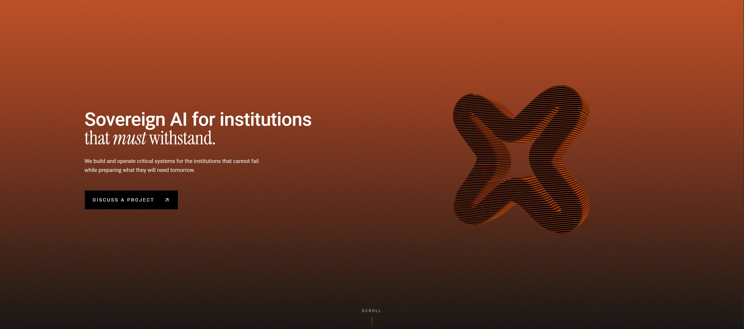
The survey was clear that the logo and the orange weren't the problem — people liked them and wanted them kept. What was missing was any real use of them. So this wasn't a rebrand. I set the whole site on black so the orange runs hot instead of decorative, and rebuilt the existing X mark into the centerpiece — a rippled, contoured form that carries the hero instead of sitting in a corner. The equity was already there; it just had to be used like it mattered.
Give the sections intent.
The draft wasn't unfinished — it was lifeless. It read as what it was: an AI-generated layout, clean but anonymous. That was the real trap. A company trying to shake the “just another IT provider, plus AI” image can't ship a site that looks exactly like one. So I gave it a language: serif headlines with a single italic word carrying the weight, set against monospace, numbered navigation and a live system readout — the site reads like an instrument, not a brochure. Corner marks, a dot grid with connectors that move, restrained motion on scroll. Each section got a reason to exist instead of a template to fill.
Before / after
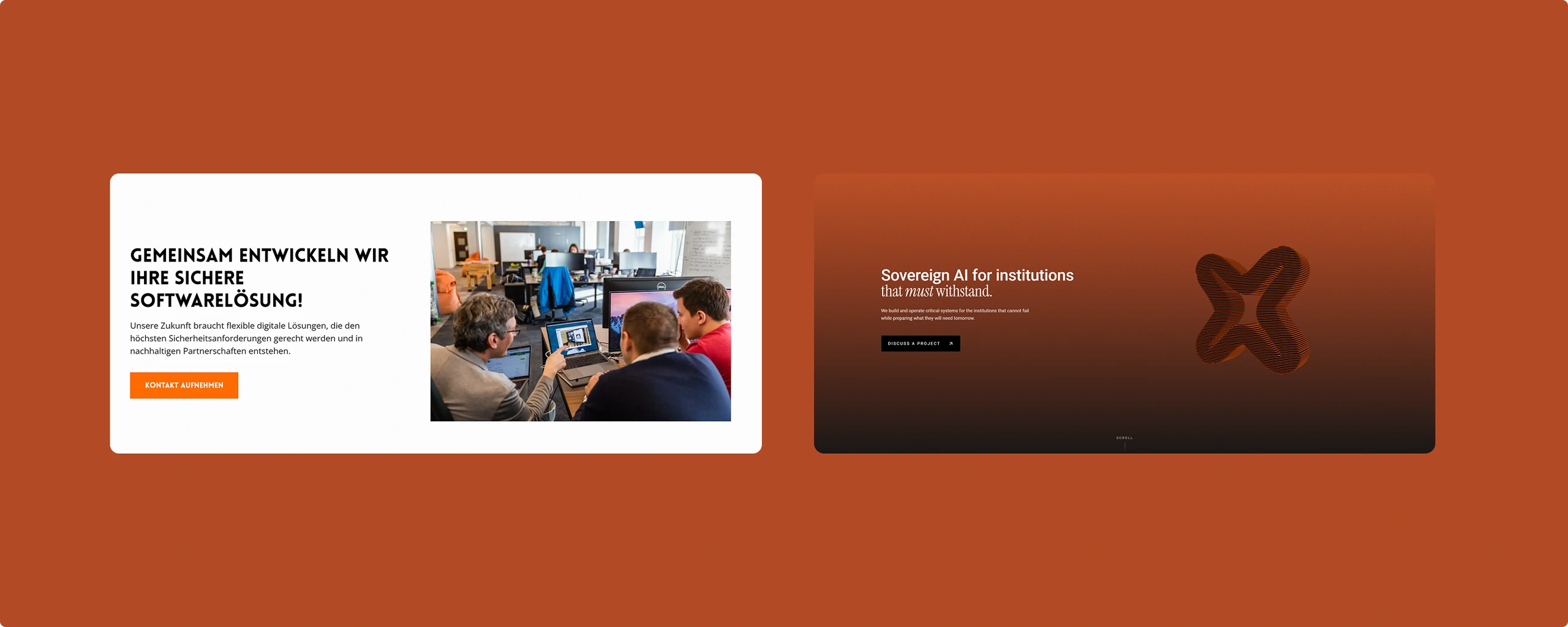
One says what any agency could say — “we build secure software.” The other commits to one thing and looks like it means it.
Result
Live at nexenio.com. It's the company's main outward face now — the first thing a client or a candidate sees.